
今天小编和大家分享有关于:“怎么使用html+css实现图片扫描仪特效?”这个问题的相关解决方法和实现的代码,希望对大家的学习有所帮助!
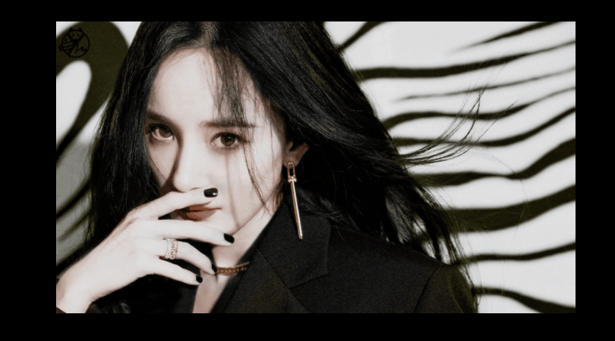
效果:
这样,有抖动的:

无抖动的:
实现:
1.定义一个盒子:
<body>
    <div class="tu"></div>
</body>
2.基本样式,长宽背景图等等~
.tu{
            width: 500px;
            height: 300px;
            background-image: url(8.jpg);
            background-size: 100% auto;
            background-repeat: no-repeat;
            position: relative;
            overflow: hidden;
            cursor: pointer;
        }
cursor: pointer;鼠标经过盒子样式为小手
3.用伪类元素做扫描线,基本样式:
 .tu::after{
            content: '';
            position: absolute;
            top: 0;
            left: 0;
            width: 500px;
            height: 35px;
            background-image: url(8.jpg);
            background-size: 100% auto;
            background-repeat: no-repeat;
            filter: sepia(100%);
            opacity: 0;

        }
filter: sepia(100%); 图片发黄。
filter: invert(100%); 像X光底片。
4.实现扫描:
.tu:hover::after{
            opacity: 1;
            animation: move 1.8s linear infinite;
        }
        @keyframes move{
            0%{
                top: 0;
                background-position: 6px 0px;
            }
            20%{
                top: 60px;
                background-position: -6px -60px;
            }
            40%{
                top: 120px;
                background-position: 6px -120px;
            }
            60%{
                top: 180px;
                background-position: -6px -180px;
            }
            80%{
                top: 240px;
                background-position: 6px -240px;
            }
            100%{
                top: 300px;
                background-position: -6px -300px;
            }
        }
让background-position的y轴位移刚好等于top的距离,然后x轴为0的话就不抖,有数值就会抖动。
完整代码:
<!DOCTYPE html>
<html lang="zh-CN">
<head>
    <meta charset="UTF-8">
    <meta name="viewport" content="width=device-width, initial-scale=1.0">
    <title>Document</title>
    <style>
        *{
            margin: 0;
            padding: 0;
            box-sizing: border-box;
        }
        body{
            height: 100vh;
            display: flex;
            justify-content: center;
            align-items: center;
            background-color: rgb(0, 0, 0);
        }
        .tu{
            width: 500px;
            height: 300px;
            background-image: url(8.jpg);
            background-size: 100% auto;
            background-repeat: no-repeat;
            position: relative;
            overflow: hidden;
            cursor: pointer;
        }
        .tu::after{
            content: '';
            position: absolute;
            top: 0;
            left: 0;
            width: 500px;
            height: 20px;
            background-image: url(8.jpg);
            background-size: 100% auto;
            background-repeat: no-repeat;
            filter: invert(100%);
            opacity: 0;

        }
        .tu:hover::after{
            opacity: 1;
            animation: move 1.8s linear infinite;
        }
        @keyframes move{
            0%{
                top: 0;
                background-position: 6px 0px;
            }
            20%{
                top: 60px;
                background-position: -6px -60px;
            }
            40%{
                top: 120px;
                background-position: 6px -120px;
            }
            60%{
                top: 180px;
                background-position: -6px -180px;
            }
            80%{
                top: 240px;
                background-position: 6px -240px;
            }
            100%{
                top: 300px;
                background-position: -6px -300px;
            }
        }
    </style>
</head>
<body>
    <div class="tu"></div>
</body>
</html>
总结:
这是网上看到一外国博主的创意,然后自己也弄了一个,虽然效果是比较简单的,但也是挺好玩的~
那么以上的内容就是有关于:“怎么使用html+css实现图片扫描仪特效?”这个问题的全部内容,更多有关于html5这方面的相关内容我们都可以在W3Cschool中进行学习和了解!
声明:本站所有文章,如无特殊说明或标注,均为本站原创发布。任何个人或组织,在未征得本站同意时,禁止复制、盗用、采集、发布本站内容到任何网站、书籍等各类媒体平台。如若本站内容侵犯了原著者的合法权益,可联系我们进行处理。